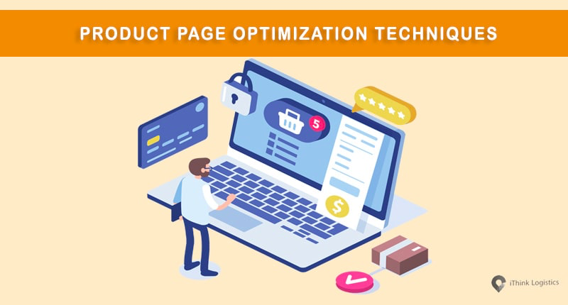
How to Create a Product Page That Converts
Your product page is the heart of your online store. It’s where visitors decide whether to buy or leave. A well-designed product page can boost sales, while a poor one can drive potential customers away.
So, how do you create a product page that actually converts visitors into paying customers? Let’s break it down step by step.
1. Use a Clear and Compelling Product Title
Your product title should tell customers exactly what they’re buying.
- Bad Example: “Wireless Gadget”
- Good Example: “Bluetooth 5.1 Wireless Earbuds with Noise Cancellation”
💡 Pro Tip: Add keywords your audience is searching for.
2. Write a Persuasive Product Description
Instead of boring text, focus on benefits and solutions.
- Highlight what it does (features).
- Show why it matters (benefits).
Example:
- Feature: “Comes with 10-hour battery life.”
- Benefit: “Enjoy your favorite music all day without charging.”
3. Use High-Quality Product Images
- Show multiple angles of the product.
- Add zoom-in features.
- Include lifestyle photos (e.g., someone using the earbuds while jogging).
💡 Customers trust visuals more than text — crisp images = higher conversions.
4. Add Product Videos (If Possible)
A short demo video increases trust and reduces hesitation.
- Show how the product works.
- Highlight size, quality, and usability.
- Keep it under 60 seconds.
5. Display the Price Clearly
- Make the price easy to find.
- If offering discounts, show the old price slashed and new price highlighted.
- Add urgency with limited-time offers.
Example: “₦15,000 ₦10,500 (30% Off – Today Only)”
6. Include Trust Signals
- Customer reviews and ratings.
- Secure checkout badges (SSL, Paystack, PayPal).
- Money-back guarantee.
💡 Social proof makes customers feel safe to buy.
7. Strong Call-to-Action (CTA)
Your “Add to Cart” or “Buy Now” button should stand out.
- Use contrasting colors.
- Keep text action-focused (e.g., “Get Yours Now”).
- Place multiple CTAs on the page (top, middle, bottom).
8. Optimize for Mobile
Most buyers shop with their phones in 2025.
- Ensure buttons are easy to tap.
- Make text readable without zooming.
- Test the checkout flow on mobile.
9. Use Scarcity & Urgency Tactics
- “Only 5 left in stock!”
- “Flash Sale: Ends in 3 hours!”
- Countdown timers can increase conversions.
10. Simplify the Checkout Process
A long, complicated checkout = abandoned carts.
- Offer guest checkout (no forced signups).
- Accept multiple payment methods (Paystack, PayPal, cards, bank transfer).
- Keep the process 3 steps or less.
✅ Final Thoughts
A product page that converts isn’t just about pretty design — it’s about clarity, trust, and persuasion. By combining strong visuals, compelling text, social proof, and smooth checkout, you can dramatically increase your sales.
Remember: Test different layouts, images, and CTAs to see what works best for your audience.